Pantry Raid! Our Top 5 Food Closets
If you’re lucky enough to have a pantry, you either love it or hate it.
For many, it’s a shameful mess of crumpled bags and dusty cans. A place where Costco items are Tetrised together in sketchy towers that collapse when someone needs a carton of freeze dried hashbrowns.
For others, it’s a peaceful haven of preparedness, where everything is beautifully organized and impeccably lit. They drink their morning coffee with the pantry door open, because it’s nicer than the sunrise.
Obviously the second club is the one to be in.
At STOR-X, pantries are our bread and butter, and epic transformations are what we do best.
Have a look.
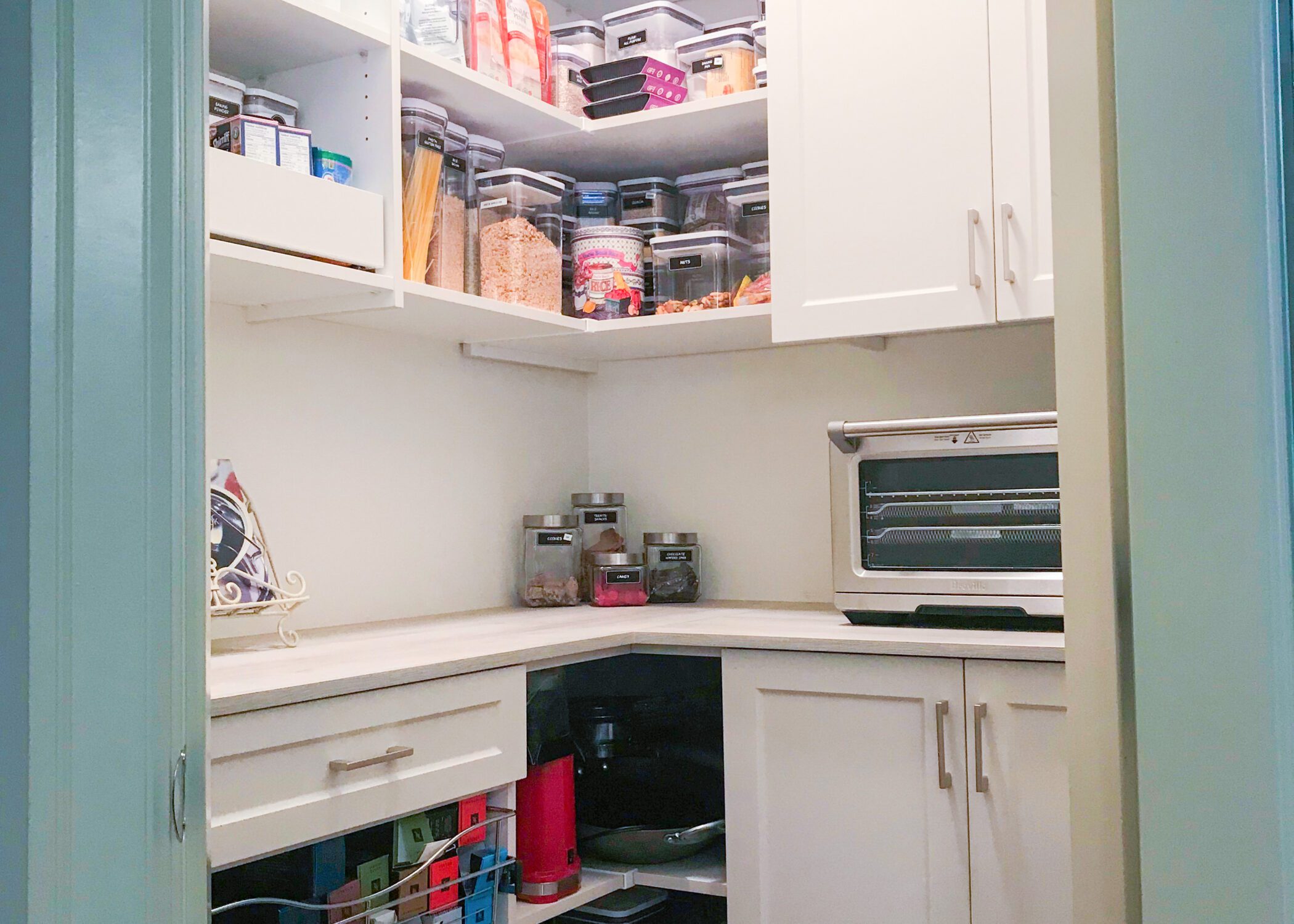
#5 by Felicia and Horace @ STOR-X N + W Vancouver, Langley, Maple Ridge
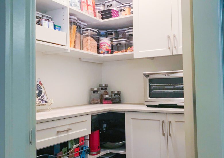
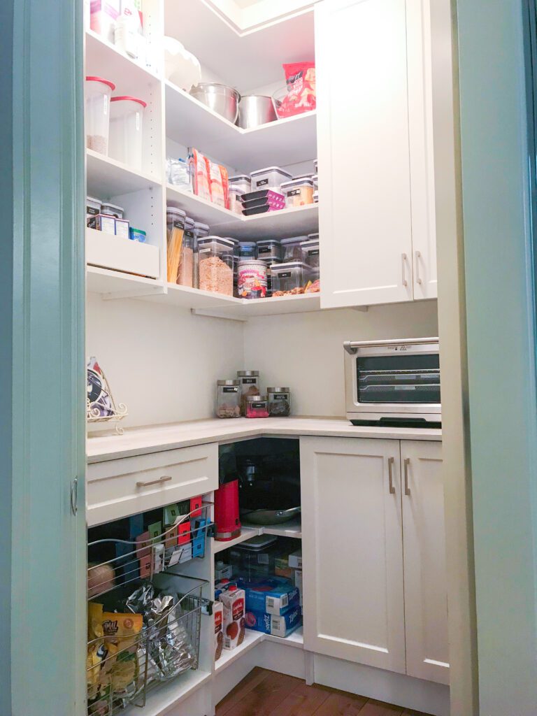
How hard can a corner work? Pretty hard… when you ditch the wire shelving. Open solid shelves keep food accessible, while roll out lower drawers hold bag clips and other clutter. A counter space was created to hold small appliances and offer a place to put things down. Like, oh, a cake.
Just look how much brighter it is in there! That’s a cooler bulb bouncing off the gleaming white countertop.
With a few smart corner pantry ideas, we’ve made this space made into something truly exceptional.
#4 by Tania and Igor @ STOR-X Fraser Valley
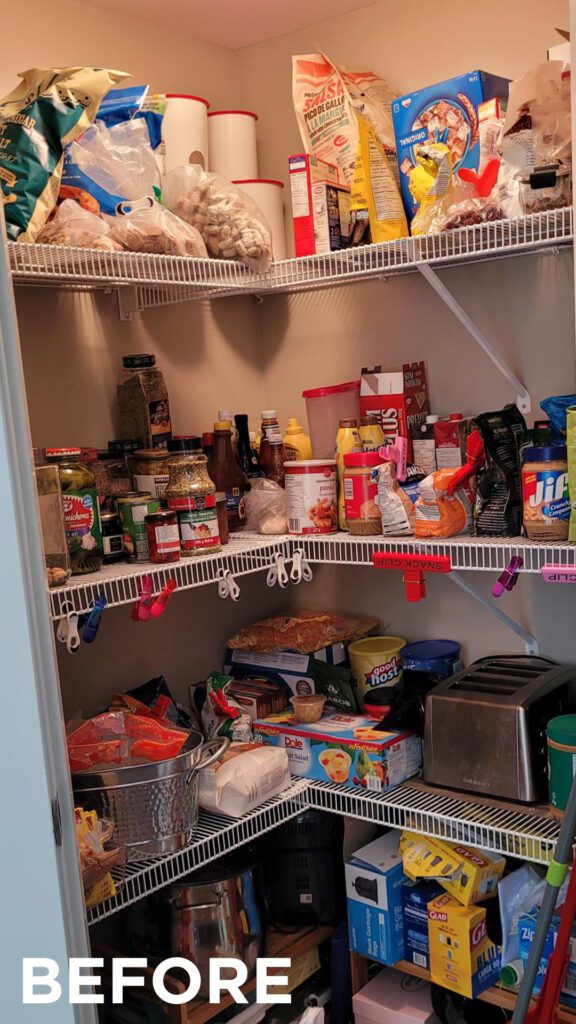
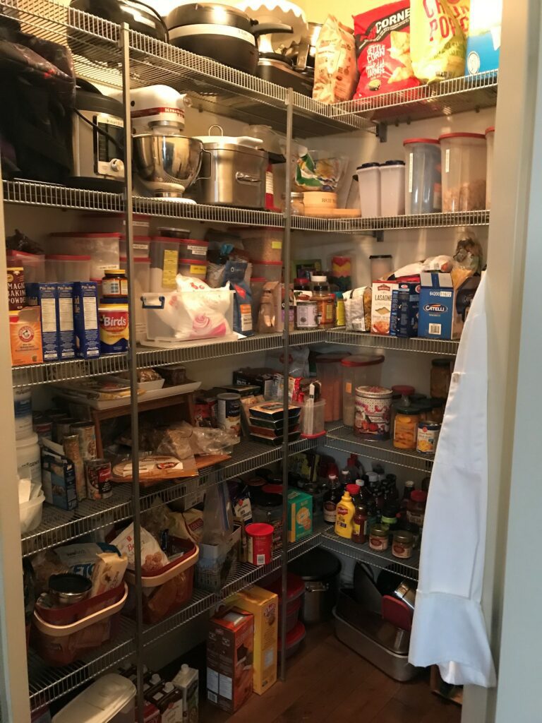
We appreciate the early effort here: The space is tidy with less-used items up high and shelves that aren’t overloaded. So why does the before shot feel like a food dungeon?
Well, it’s super dark. And the heavy items look like they’re pushing the weight limit of that wire shelving.
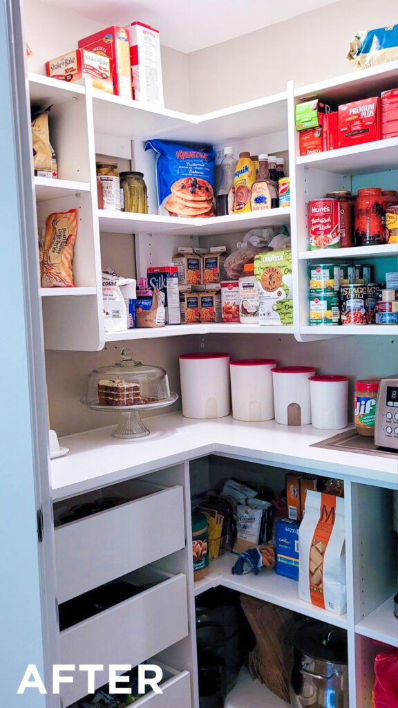
We split this space in half with uppers and lowers, and things improved immediately. A bright white countertop reflects the now-cooler ceiling light. Heavy items are hidden behind cabinet doors. Basket pull outs store bags and such. Clear containers form tidy stacks to the ceiling.
The finish here is White Lancaster with Elite Aluminum Pulls in Chrome.
#3 by Sharon @ STOR-X Calgary
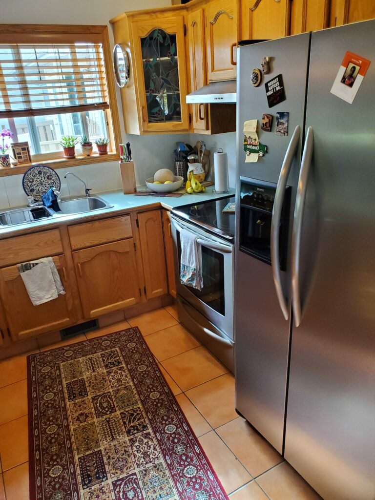
Don’t have a pantry? Make one. In this before shot, a beefy stainless fridge dominates the kitchen, pantry items are split among the cabinets, and the golden hue just looks old.
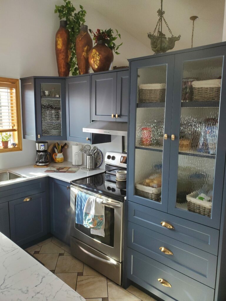
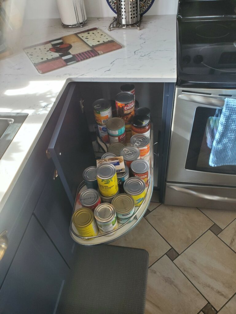
To fix it, we rethought it. The fridge moved to the other side of the room, leaving a huge chunk of real estate for a gorgeous furniture-style pantry. Semi-transparent glass keeps guests from reading what brand of spaghetti you buy. Fabric-lined baskets store grab-and-go foods in the loveliest possible way. Corner shelves with next-gen lazy Susans hide cans and containers.
The grandma’s cabin look was replaced with a deep slate blue that feels like a classically modern pantry design.
#2 by James @ STOR-X Burnaby, Surrey, White Rock + Tri-cities
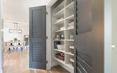
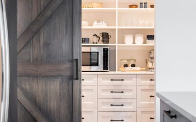
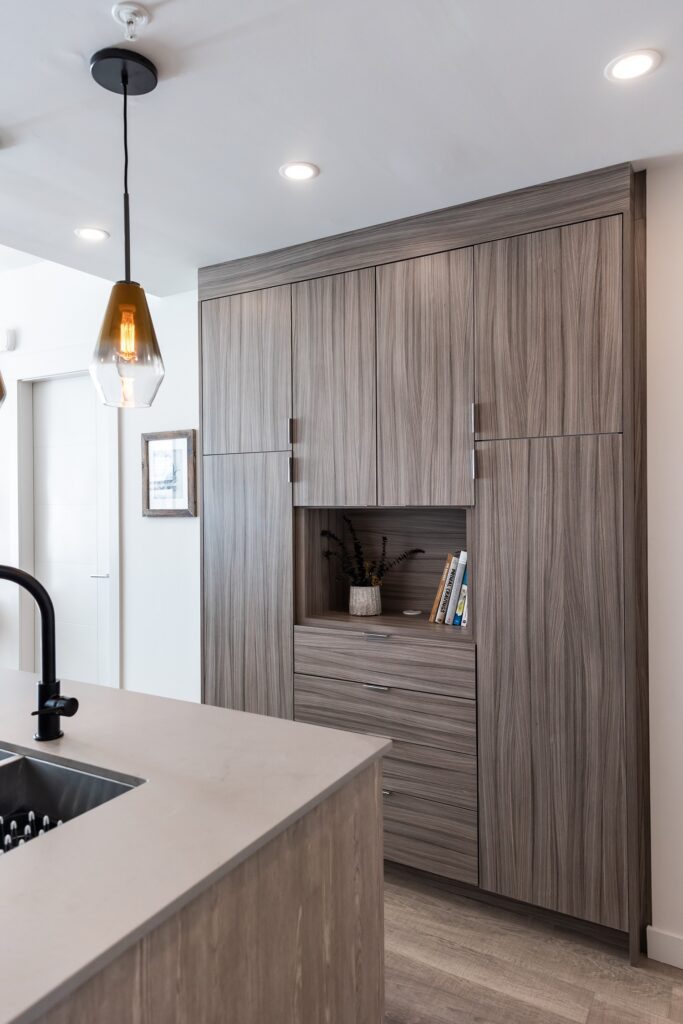
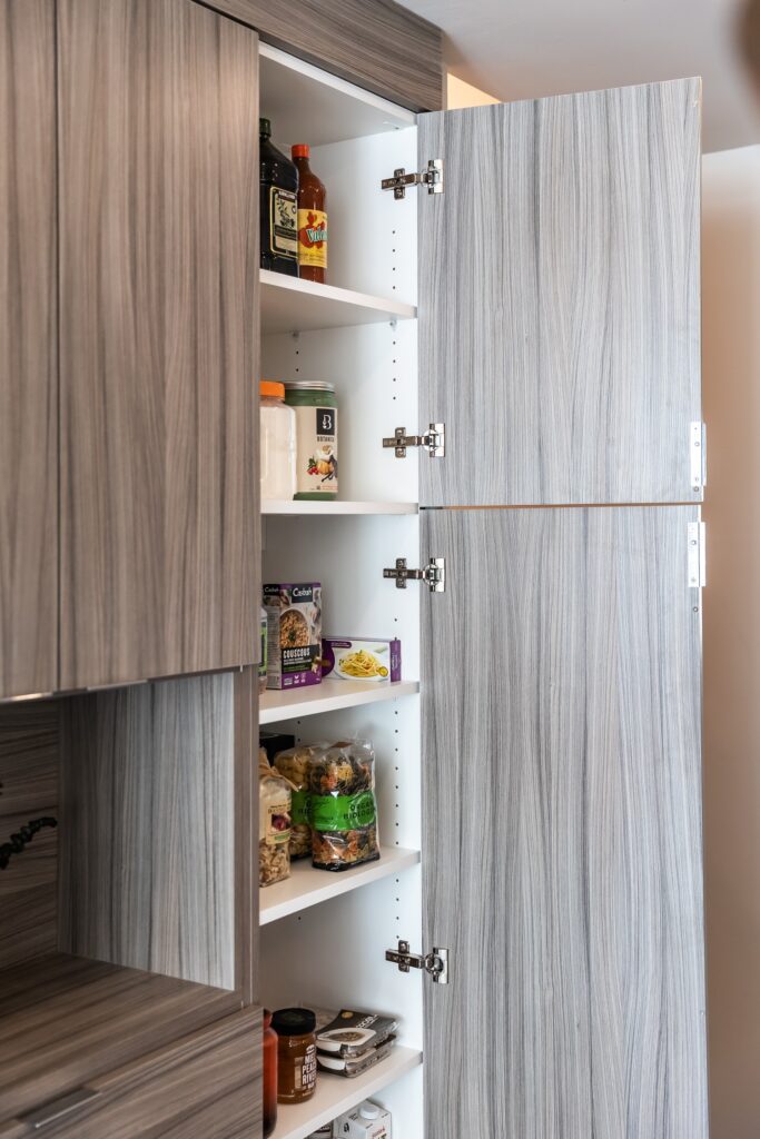
We love this ultra-contemporary secret pantry. There could be anything in that full-height unit, but there happens to be food. Simple open shelves give jars and cans a home, while flat panel doors keep everything sleekly out of sight. One of our favourite wall pantry tips: Build an open storage area into the centre. It’s a perfect home for a plant and some cookbooks.
New construction is a fresh canvas—and an opportunity to get it right the first time.
Doors feature our Sandalwood finish with Elite Aluminum Pulls in Chrome.
#1 by Felicia and Horace @ STOR-X N + W Vancouver, Langley + Maple Ridge
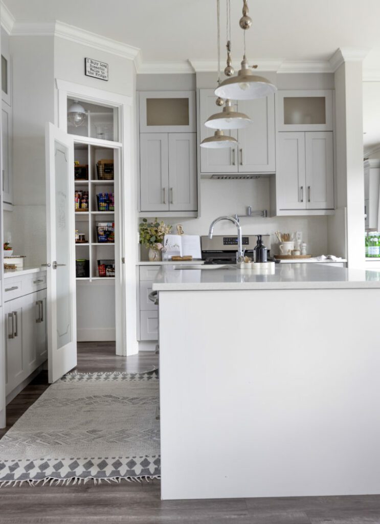
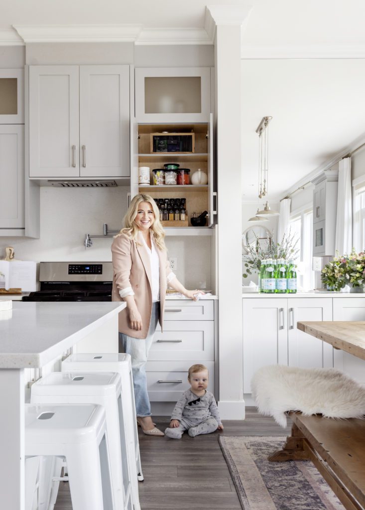
Natalie Langston’s popular blog promises to help you create your dream life. When it was time to renovate the heart of her home, she turned to STOR-X.
“I absolutely love having a pantry, but I found myself packing the wire shelves with so many jars it looked like they were going to collapse. We needed a better system!”
We worked with Natalie to design a pantry that feels clean, organized, and not over-crowded.
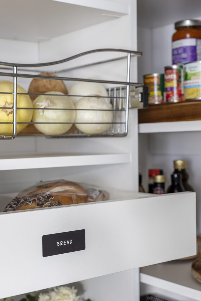
Open shelving shows her everything she’s got to work with. Garbage and recycling is hidden away, beautifully integrated into the design. The mixer, waffle maker and cake plates are all on display. Wire baskets hold produce that can be pulled out and pushed back. Tags add charm and clarity. We included shelving low enough for her boys to be able to grab their snacks on their own.
Natalie picked the hardware to match the rest of the kitchen.
