Home Design Colour Trends for 2022: Setting the Tone for a Fresh New Year
As we head into Year Three of a global pandemic, many of us have started to feel our walls closing in. A kitchen that seemed small in 2019 now feels like an actual shoebox. A bathroom that once seemed a bit dated now feels dingy, old and tired. Things we once found charming about our homes now drive us nuts.
There are a few ways to deal with such a feeling. You can move, you can take a long holiday, or you can redecorate. That last one is going to give you the most bang for your buck, so let’s start there.
Colour in a room is a lot like music. It has the ability to impact your moods and behaviours. It can even influence physiological reactions. But as a science, it’s tough to pin down. Experts have found that your perception of a colour is going to be heavily influenced by your experiences with it.
With that in mind, let’s take a look at the various Colours of the Year that have been announced that influence interior design trends for 2022. Maybe there’s one in the mix that will feel just perfect for your brand new (old) space.
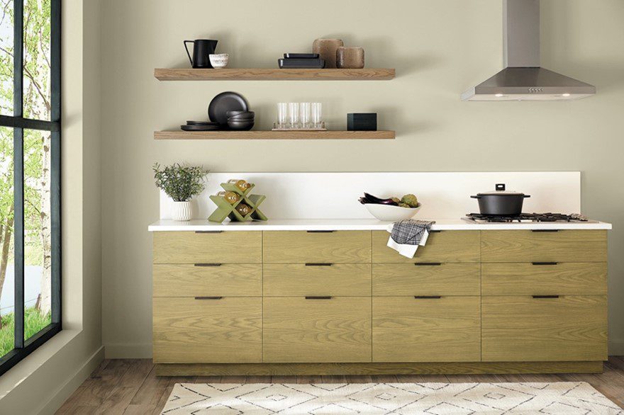
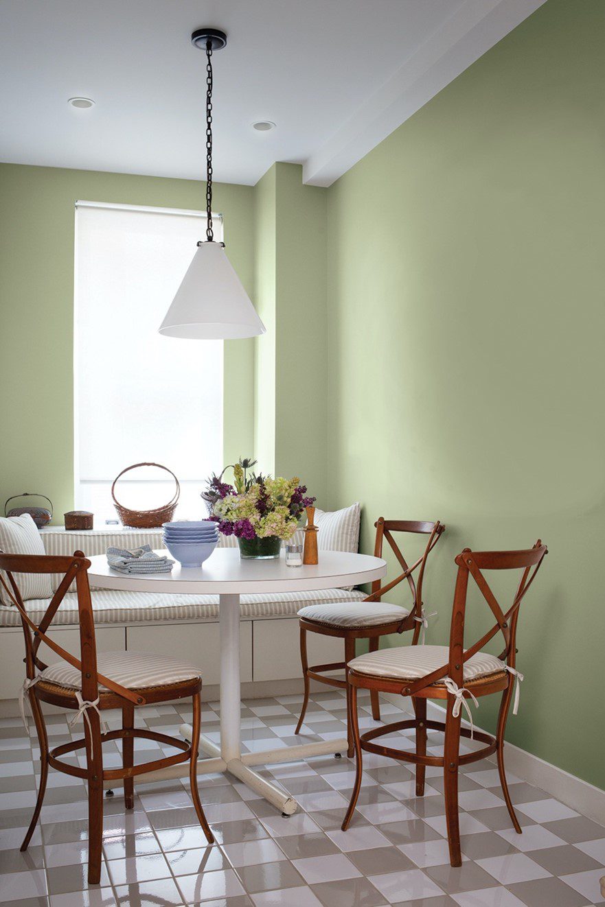
Gentle Olive by Minwax
A soft sage with subtle gray undertones, Gentle Olive highlights the natural beauty of the wood when applied to furniture, cabinetry, shelving, decorative items, and more. Chosen for its connection to wellness and the restorative qualities of nature, Gentle Olive imparts a soothing atmosphere to living areas, kitchens, bedrooms, and more.
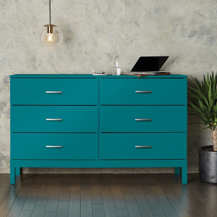
Satin Rolling Surf by Krylon
Embodying optimism, stability, and balance, Satin Rolling Surf reflects the renewed focus on well-being and mindfulness that’s currently driving home trends. The bold, refreshing blue draws inspiration from nature to deliver a sense of calm to both exterior house colours and interior design trends for 2022.
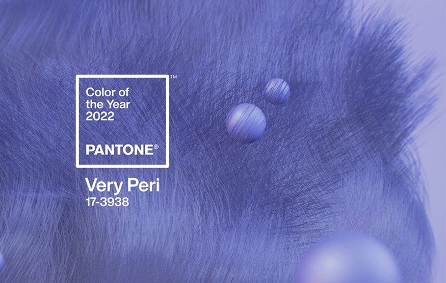
Very Peri by Pantone
Pantone created an entirely new hue for its 2022 pick. Very Peri is a vibrant shade of periwinkle that blends the soothing familiarity of blue with the energy and excitement of red. Designed to pique curiosity and creativity, the warm, joyful hue is meant to symbolize our transition out of pandemic isolation.
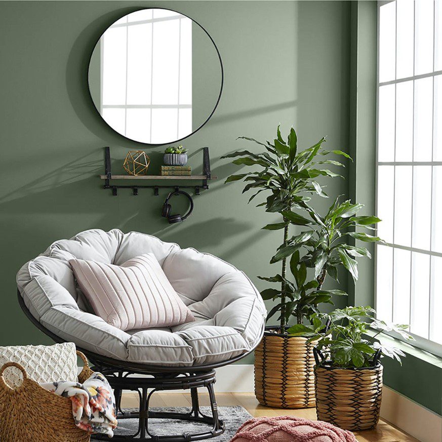
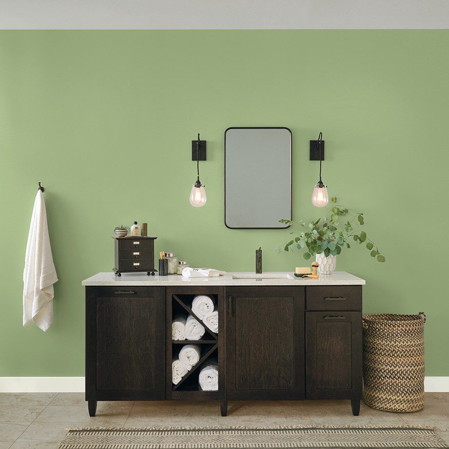
Laurel Leaf by Better Homes & Gardens
This dusty green shade mimics the rejuvenating appeal of eucalyptus leaves and reflects a renewed desire to incorporate elements of nature into our homes. Because of its organic feel and warm undertones, Laurel Leaf pairs beautifully with creamy whites, cozy beiges, light to medium wood tones, and leafy house plants.
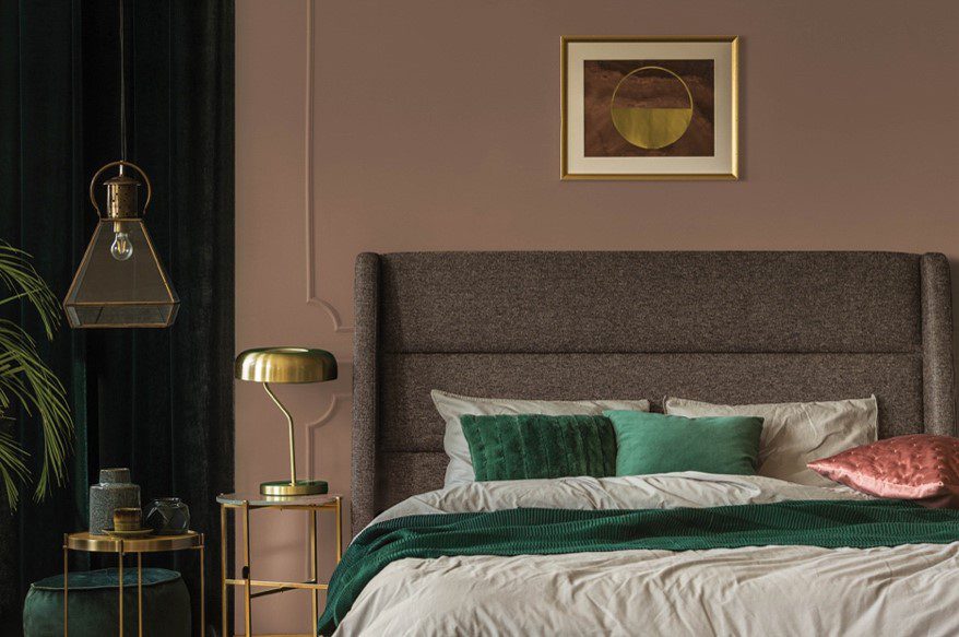
Art and Craft by Dunn-Edwards
A soft, sophisticated brown that channels the richness of walnut wood and offers a peaceful, grounding effect. “Art and Craft is truly a down-to-earth color that signifies stability, comfort, and calm, a colour that expresses what we all seek right now,” said Sara McLean, colour expert and stylist for Dunn-Edwards.
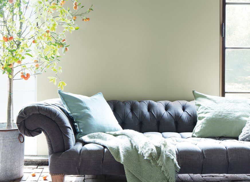
October Mist by Benjamin Moore
Benjamin Moore’s Colour of the Year for 2022 is a botanical shade mimics the pale green of a flower stem and serves as the foundation for the brand’s larger 2022 palette. The assortment includes 14 nature-inspired hues that span tinted off-whites, warm earth tones and refreshed primary colours.
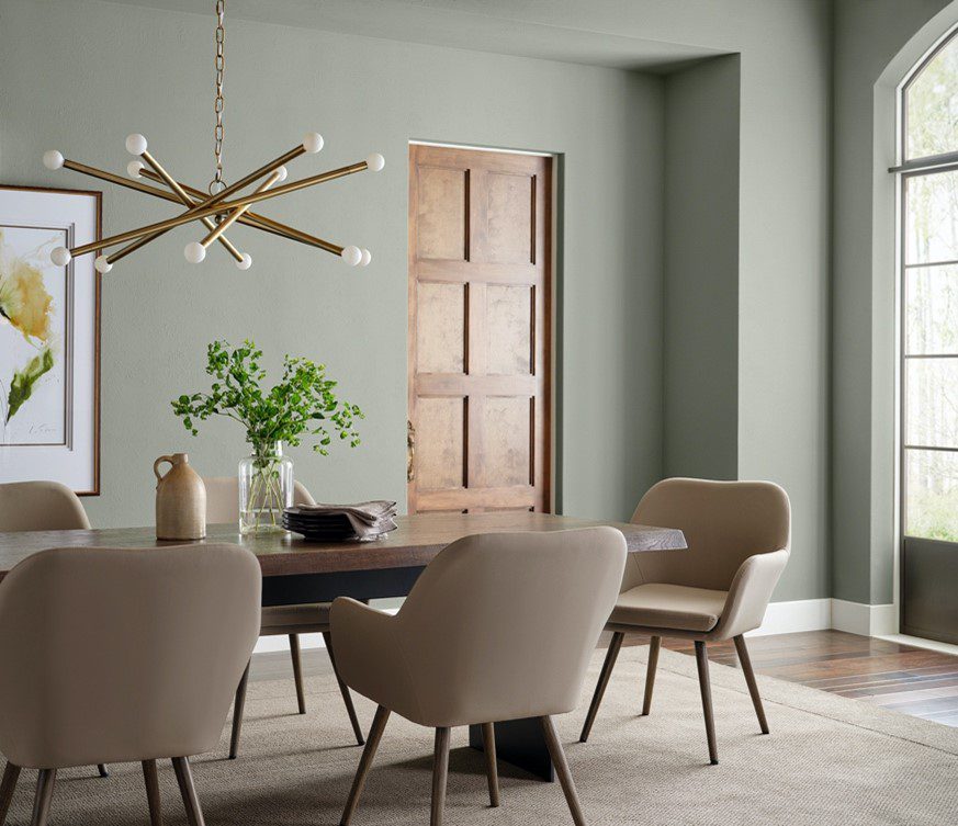
Evergreen Fog by Sherwin-Williams
Evergreen Fog signifies a shift away from the cool neutrals and brilliant jewel tones that have previously dominated paint colour trends. Sherwin-Williams’ Colour of the Year 2022 can extend a comforting welcome in entryways, establish quiet and calm in bedrooms or bathrooms, and introduce restorative energy to living rooms, kitchens and other common areas.
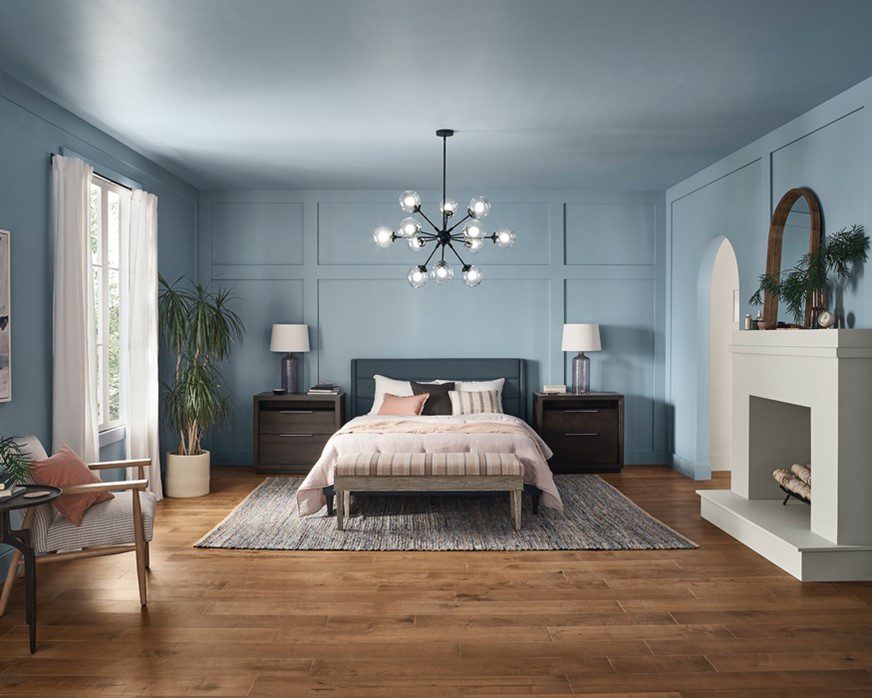
Aleutian by HGTV Home
Like a well-worn pair of faded blue jeans, Aleutian embodies comfort and relaxation. This washed-out indigo serves as the foundation of a larger 2022 colour collection. Combining soft neutrals with muted earth tones, the mix of 10 complementary hues is intended to create a sense of comfort and calmness with colour.
Guacamole by Glidden
This ripe avocado-green delivers crowd-pleasing colour that’s both relaxing and refreshing. In a press release, the brand noted that online searches for green paint colours have more than doubled since 2020, indicating that homeowners are seeking colours that soothe.
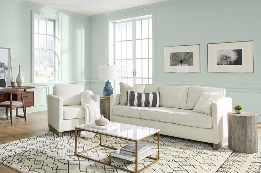
Breezeway by Behr
The soft, silvery blue-green is reminiscent of sea glass found along sandy beaches and the crystal-clear water of a tucked-away bay. Because of its ties to nature, Breezeway establishes a feeling of tranquility, but its crisp brightness can also inspire energy and liveliness.
Olive Sprig by PPG
Reminiscent of a soothing aloe vera plant or velvety sage leaves, the gray-green colour was chosen to represent regrowth and the resiliency of nature as we adapt to new ways of living post-pandemic. The lush mid-tone feels familiar and grounding, and it’s versatile enough to be used as a livelier alternative to traditional neutrals.
Sage Green by Stor-X
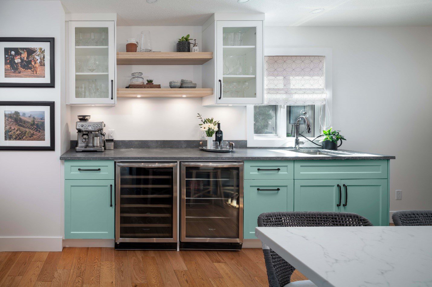
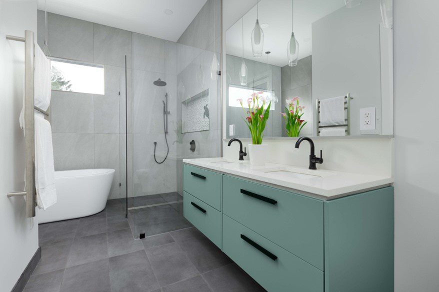
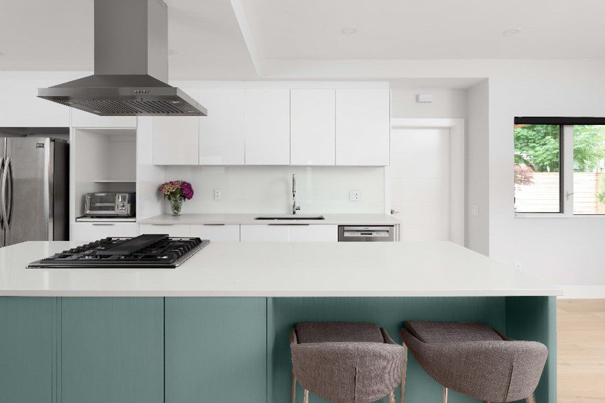
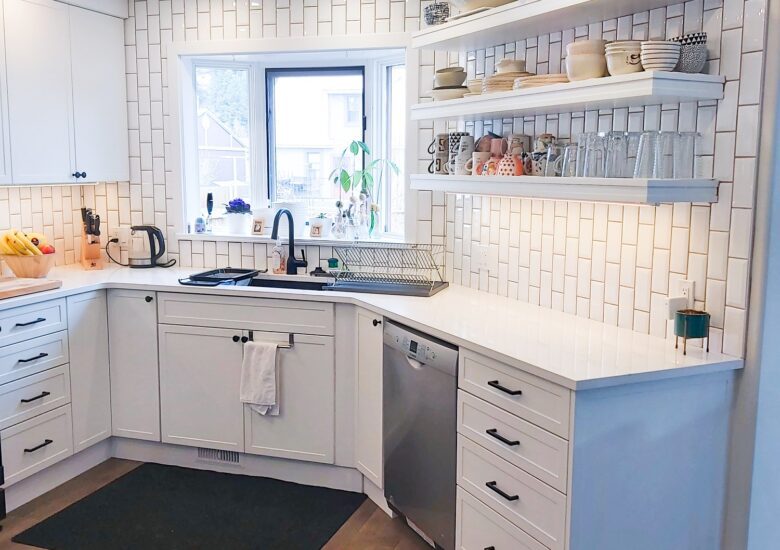
That’s right—we’ve got a Colour of the Year, too. Our Sage Green is an easy and invigorating way to breathe life into a blah white space, and it’s totally on-trend. We love it on lower cabinets to add a sense of vibrancy that doesn’t overwhelm.
Is it right for your space?
Find out with a complimentary consultation, and let’s get this year off to a bold and bright start.
